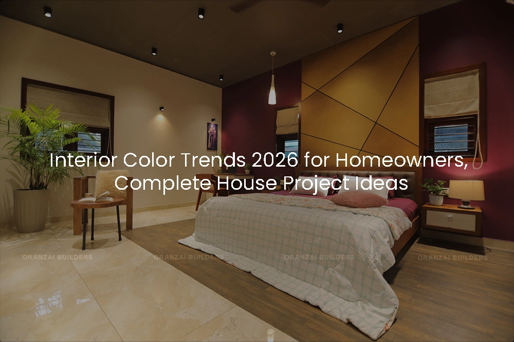
When you plan a full house project, from architecture to interiors, every decision carries weight. Layout, structure, materials, finishes, and yes, color. Color is not just about style, it shapes how a home feels, how light behaves inside it, and how well the design ages over time.
Homeowners often ask us one simple question during the planning stage, “Will this still look good years from now?”
That is the right question to ask.
Based on what we see on real construction sites, completed homes, and long-term interior performance, these are the key color directions shaping homes in 2026. This is not about short-lived trends, but about colors that work well in complete house construction and interior projects when planned properly from day one.
We focus only on full A to Z house construction and interior execution for property owners. That means colors are selected with structure, lighting, materials, and daily living in mind, not as surface-level decoration.
Ice blue is a soft, clear shade that works especially well in homes designed with natural light and clean architectural lines. It brings freshness without feeling cold or clinical.
In complete home projects, ice blue performs best in:
Because it is subtle, it ages well and does not overpower the space. When planned during the design stage, it integrates naturally with lighting and finishes.
Teal continues to hold strong because it sits comfortably between blue and green. It adds character without closing in the space.
We often see teal working well in:
In full house interiors, teal works best when it is part of a controlled palette, not added later as an afterthought.
Amber tones, sometimes called burnt caramel, bring warmth that feels natural rather than decorative. They sit comfortably alongside stone, timber, and brass finishes.
For homeowners who want color but are unsure where to start, this is a safe and sophisticated choice. It works especially well in:
These tones feel rich without being heavy when planned properly with the overall construction and interior design.
Chartreuse is not for every surface, but when used intentionally, it brings energy to a home. In complete house projects, we treat it as an accent, not a base color.
It can work well in:
The key is planning. When chartreuse is integrated at the design stage, it feels intentional rather than risky.
Deep reds like burgundy and oxblood have proven their staying power. They bring depth, elegance, and a sense of permanence.
These shades shine in:
In full house construction, these colors work best when paired with proper lighting design and natural materials.
Plum sits between red and purple and adds personality without becoming overwhelming. It works well in homes where the design balances modern and classic elements.
Used thoughtfully, plum complements:
Again, success depends on planning, not impulse decisions.
Khaki may sound simple, but it is one of the most versatile colors we see in modern home interiors. It bridges beige, taupe, and soft green, making it ideal for long-term living.
Khaki works exceptionally well in:
For homeowners who want a calm, cohesive home, khaki is often the best foundation color.
Color should never be decided in isolation. In complete house construction and interior work, color interacts with:
This is why early collaboration with an architect and interior designer is essential. When color decisions are made alongside construction planning, the result feels balanced, intentional, and timeless.
Trends come and go, but well-planned homes last. The right colors, chosen with structure, materials, and daily life in mind, elevate the entire living experience.
If you are planning a complete house project on your own property, start with strong design thinking, clear execution, and professionals who understand the full journey from architecture to interiors.
A well-built home deserves equally thoughtful interiors. When both are planned together, the results speak for themselves.
If you are at the early stage of planning, speak with an architect, interior designer, or construction professional who handles complete home solutions from start to finish. It makes all the difference.